Client
Tio Business School
Role
UX/Visual Designer
Industry
Education · Branding
Timeline
2022 · 6 mos
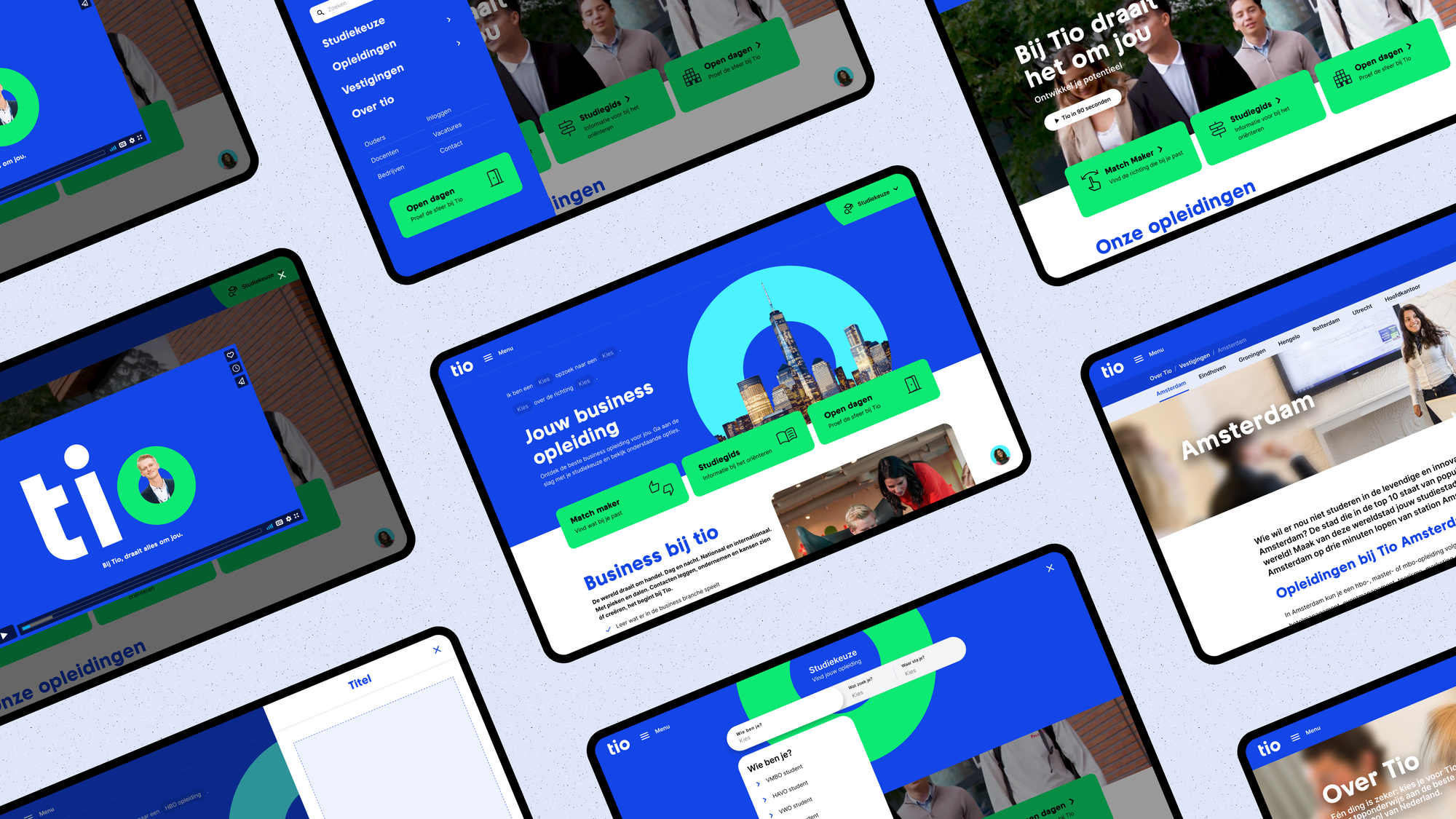
As the main Visual/UX Designer via Clutch, I was responsible for iterating and delivering on almost everything besides the brand for Tio; from first wireframes and information architecture to final visual designs and micro-animations. We went beyond just redesigning the previous website by implementing a matchmaker, dynamic content, a launchpad tool, and advising on the next steps to boost conversion and engagement.
A brief history of Tio
Tio is a private business school founded in 1969 offering bachelor programmes in hospitality, tourism and business. They believe in small classrooms, personal attention, and empowering students. The Higher Education Guide rated Tio the Best University of Applied Sciences (small size) in the Netherlands. In addition, according to the Higher Education Guide Tio is home to the most highly rated hotel school (HEM), tourism bachelor course (ITM), business bachelor course (IBM) and bachelor course in marketing (CEO).
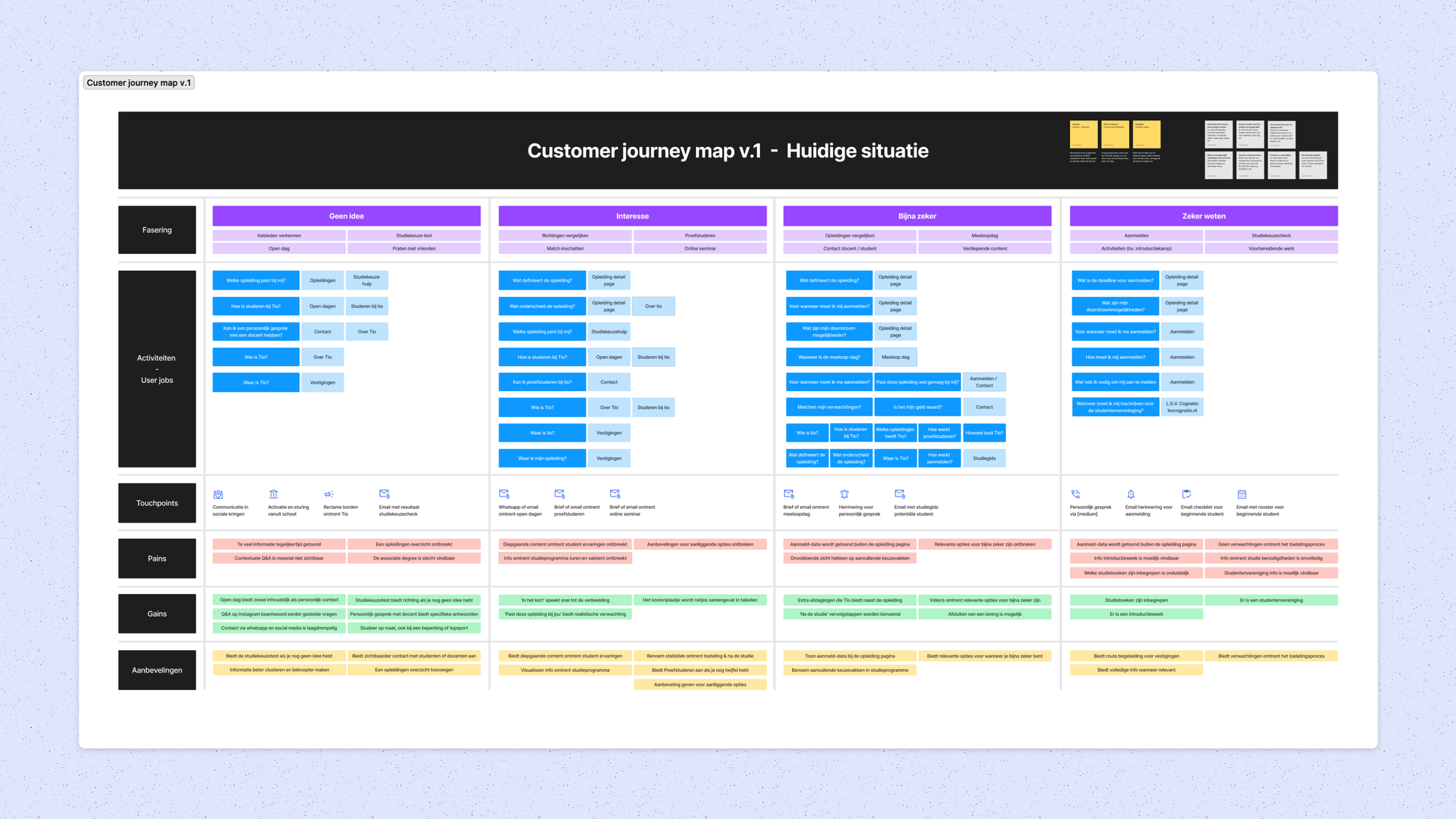
Mapping the current state
The importance of analysis and discovery was showcased by asking the right questions; Who are our users? What is the website used for? When is it used? What situations is it used in? What will be the most important functionality? What’s the biggest risk to product delivery? As a result, we split the journey of finding a bachelor program into four phases; 1) No idea, 2) Interested, 3) Almost sure, and 4) Sure i.e. sign up. The underlying pain, gains, and recommendations formed a starting point for the dialogue around our first demo’s.
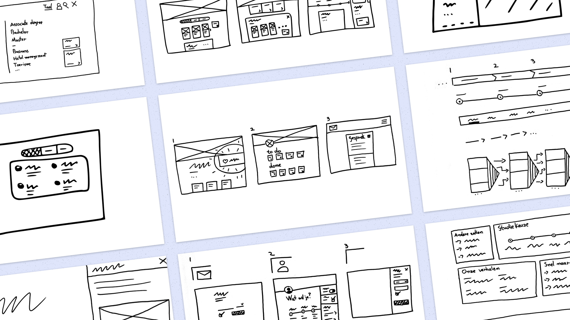
Sketching the desired state
Visualising first ideas very rapidly, and bringing a large quantity of ideas to the table helps ensure the quality of ideas to pick from. This is an important moment in the design process fo the creative director to checks-in and see if the quality is there before presenting for the client. After making some adjustments to the direction of the story and concept convergence became top priority.
Defining the service concept
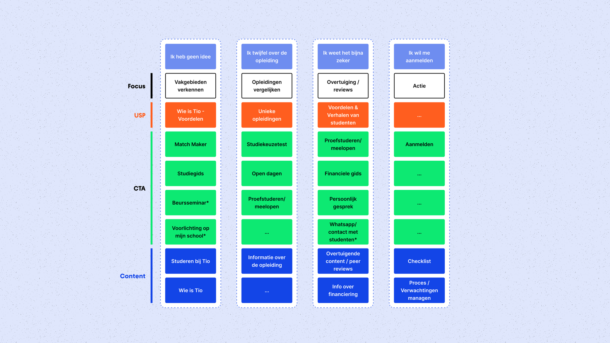
How does it look when we merge the agreed upon ideas with the current content on the website? By translating the four stages of the customer journey to classifications of student archetypes with each their respected content, actions, and journey resulted in a mental model for the client to make sense and a framework internally to continue building on.
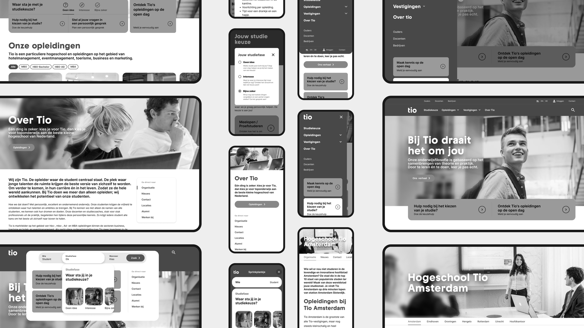
Zooming in on functionality
After collecting input fom Tio and the team, I started wireframing probable solutions directions for core features like navigation, tooling, page templates. I iterated on the final features with the brand designers and developers.
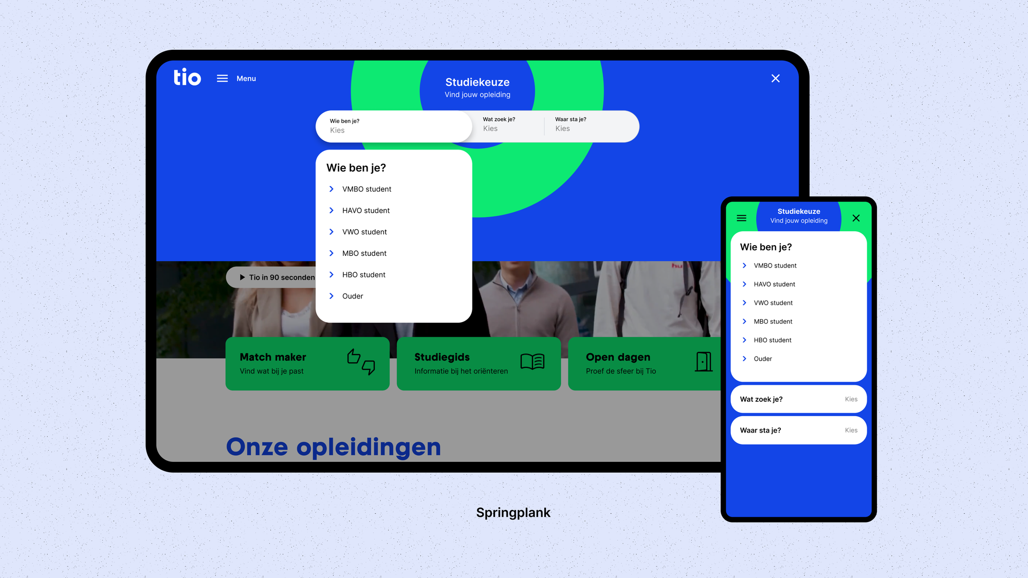
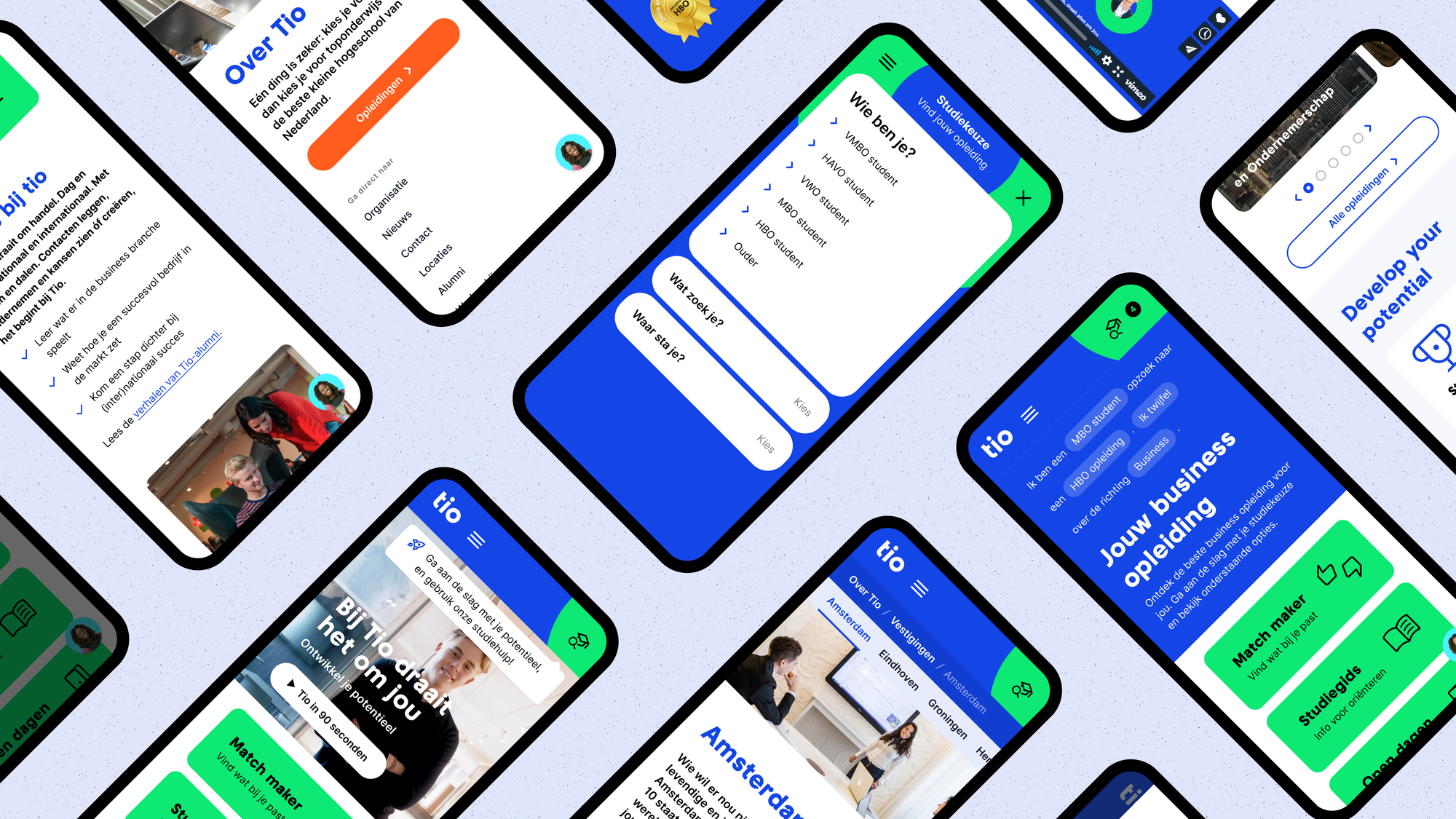
Guiding you’re study choice
How might Tio know which content to put on which page with the customer journey (student archetypes) in mind? Instead of making the information architecture more complex we advised on asking the aspiring student through some form of tooling to help with a well-considered choice for a bachelor's degree program.
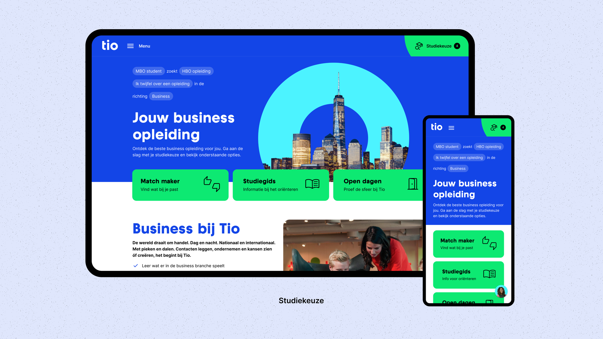
Poviding content you need
The user filled in the following: a) which program they completed beforehand, b) what for program they’re looking for, c) where they stand in their decision-making process, and d) which direction of program they prefer. As a result we can guide the user to a tailor-made landing page with dynamic content, and actions (e.g. tooling, study guides, visiting days, and more).
Learnings
What I’ve learned is the value of lean UX in short timespans. Clutch approaches small to medium scale CMS-based websites and rebranding projects in boosts. Resulting in clear, tangible results within a month or two. For Tio, an intense level of collaboration and iteration with both the client and brand designers resulted in the polished UX concepts.
Credits
Remy Lammers – Creative Director • Maxim Pashchenko – Brand Lead • Laura Van Steveninck – Brand Designer • Sjoerd Klatser – Brand Designer • Lauren Maxwell – Story Designer • Chantal Valk – UX Design Intern.
Next case
Vattenfall Salesflow